Hair Loss
/Blackpool South shore.

Blackpool South shore.


Some late night brand developments that never saw the light of day...until now!

Last week one our 3rd Year Advertising students, Jemma Redpath, attended the 5th annual Design Manchester all-day conference. She's kindly sent through some of her thoughts for Disciples...
The Design City Reframed conference was an experience full of diverse speeches and presentations that have certainly left an impression on me. The conference covered all sorts of topics including branding, architecture, film and modern art that were very refreshing. However, some were a little more random. One designer (not to mention names) spent his whole allotted time talking about writing songs for his LP- which would have been fantastic if we had seen some of the actual process. Half way through the talk he revealed, “by the way, you’re not actually going to hear any of my songs.” Not the best start to the event I must say!
There were however some really great speeches that made up for the disappointing start of the conference. Louis Mikolay from North gave a fantastic talk all about the rebranding of the Science Museum. As we know there was a lot of public backlash about ditching the existing brand image, but he represented his agency well and stood by North’s decisions and final work. I took away 3 main lessons from his talk… Number one: research is important. Number two: making visual observations of a brand will help you to identify ways to develop it further. Number three: be brave and stand up for what you creatively believe in, even when other people’s opinions might differ.
Tash Wilcox who is currently working with Hyper Island and Jane Murison, from the BCC, talked about very similar topics. Murison talked about how a lot of the time, we don’t make informed decisions due to our tendency to wait to be given information, and how social media has emotional consequences if we use it too much or too less. Wilcox relatedly discussed how we often seek the approvals of others on social media and how that can stop us from exercising our brain. Both talks were slightly anti-tech but amongst the humour and jokes they both highlighted some important advice. Firstly, we can make our own choices by making the good popular and the popular good. Secondly, we can put technology aside and strengthen our mind by developing our physically talents such as drawing and painting.
Overall, I would definitely attend the conference again. It was full of creativity and I genuinely left feeling motivated and more excited about my own projects. The general atmosphere was great to be in and it was reassuring to know that some of my own student creative worries were echoed amongst such successful and accomplished people. I look forward to attending similar events in the upcoming months and I most certainly am looking forward to attending the next Design City Reframed.

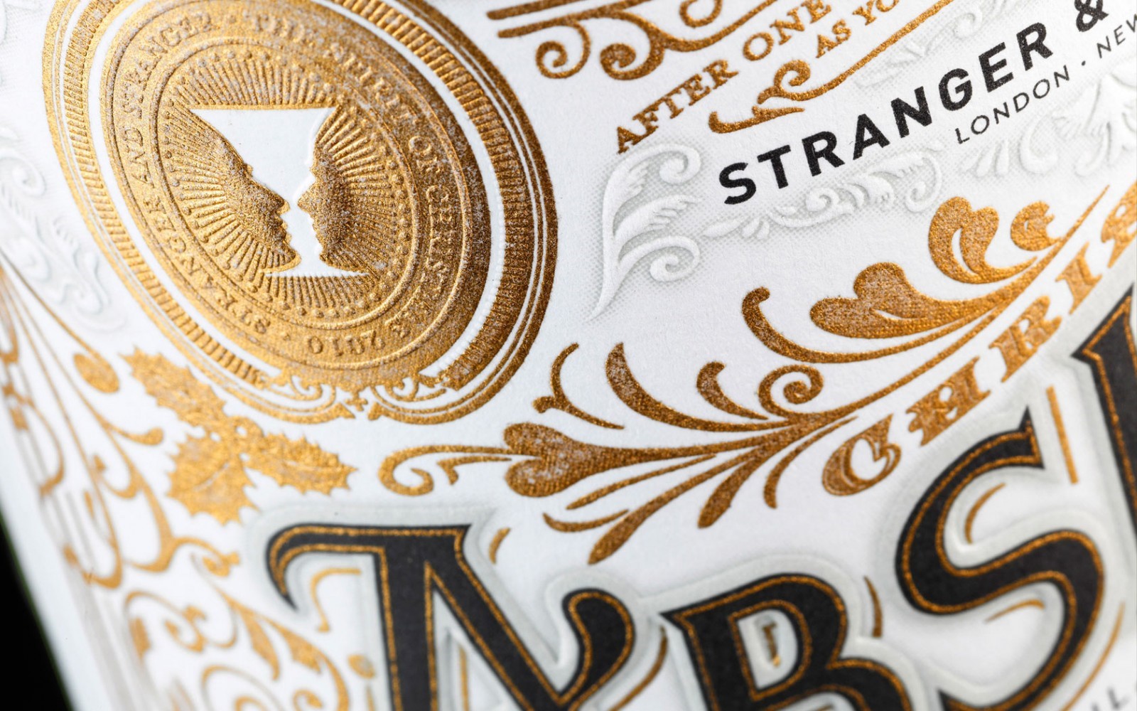
Tom Shaughnessy, Design Director at Glorious and also friend of the course has shared with us an agency called Stranger & Stranger. They're an agency who somehow slipped through the net on my radar, but are definitely worth sharing with you. Specialising in packaging and branding they are an agency who create - rather, craft - exceptional and exquisite pieces of design.
Mainly for the alcoholic drinks industry, they design the labels, bottles, packs and everything that falls under their client's brand. It's worth spending some time understanding and appreciating the level of craft and detail through typeface selection, illustration style through the idea and the actual end product itself. They also have an interesting design mantra:
DON’T FIT IN, STAND OUT ™
They've also designed and printed a beautiful book featuring a few hundred of the four and half thousand jobs they’ve done over the past 20 years. It is expensive but quite a few blogs give you a sneek peek.


For the guests who had travelled from across the land, and in accordance with the Reverend's good wishes, a temperance dispensary was established with the upstanding advice:
"Hold ye fast to sobriety."
Sage words indeed, though there were murmurings some tipples had a particularly gratifying warming effect. Such notions have been noted before and are considered to be the way when in close quarters of the Reverend and his works.
A gratifying time was had by all and we wish Andy and the Reverend all the best for Typographic Specimens.

The reverend in modern day garb
A time lapse of visitors enjoying the findings


the fantastic lantern show
A time lapse of the signings

The fantastic Design Manchester festival will be taking place this year between the 11th and 22nd of October. There are a wide range of events (both ticketed and FREE) taking place, with the highlight being the Design City Conference.
It has been a great, inspiring event in recent years - plus there are potential networking opportunities and a chance to meet other designers.

During the summer months, Andy and I have been sorting through the plan chests and have unearthed a few pieces of work we wanted to share with you. The first is a personal project completed by Mike Rigby, dated 2002. Its concept is as relevant to day as it was fifteen years ago, and it's easy to see the difference it could make.
The idea was one of those that was happened upon during a conversation between Mike and Andy; I am informed most likely to have occurred between the walls of a public house.
Mike wrote the copy which you can read on the poster, it's worth noting the power of well-written and crafted copy in helping to clarify and communicate a concept. As an aside it's also interesting how an idea of social change became a reality for Mike when he and his team rebranded Alzheimer's Australia.


“Did I think I’d see The Disciples Of Design live again? Not in this lifetime.”
Welcome back to The Disciples Of Design. You may be old enough to remember the previous incarnation of this website which was sadly attacked and brought down by digital curmudgeons. However, we are happy to say that The Disciples Of Design are now back online with a new hub for all things design.
We have tried to salvage as much as we can via the Wayback Machine - especially the profiles of ex-Preston students who are now part of the global design community. But there is still much more there for you to have look through so please head over there as well.
We have uploaded lots of students videos to our new youtube channel, as well as reinstating our instagram account. If anyone would like to contribute please get in touch.
We are delighted to announce the upcoming launch of Andy's book - Typographic Specimens. There will be much more to come about this over the coming months. Keep your eyes peeled.
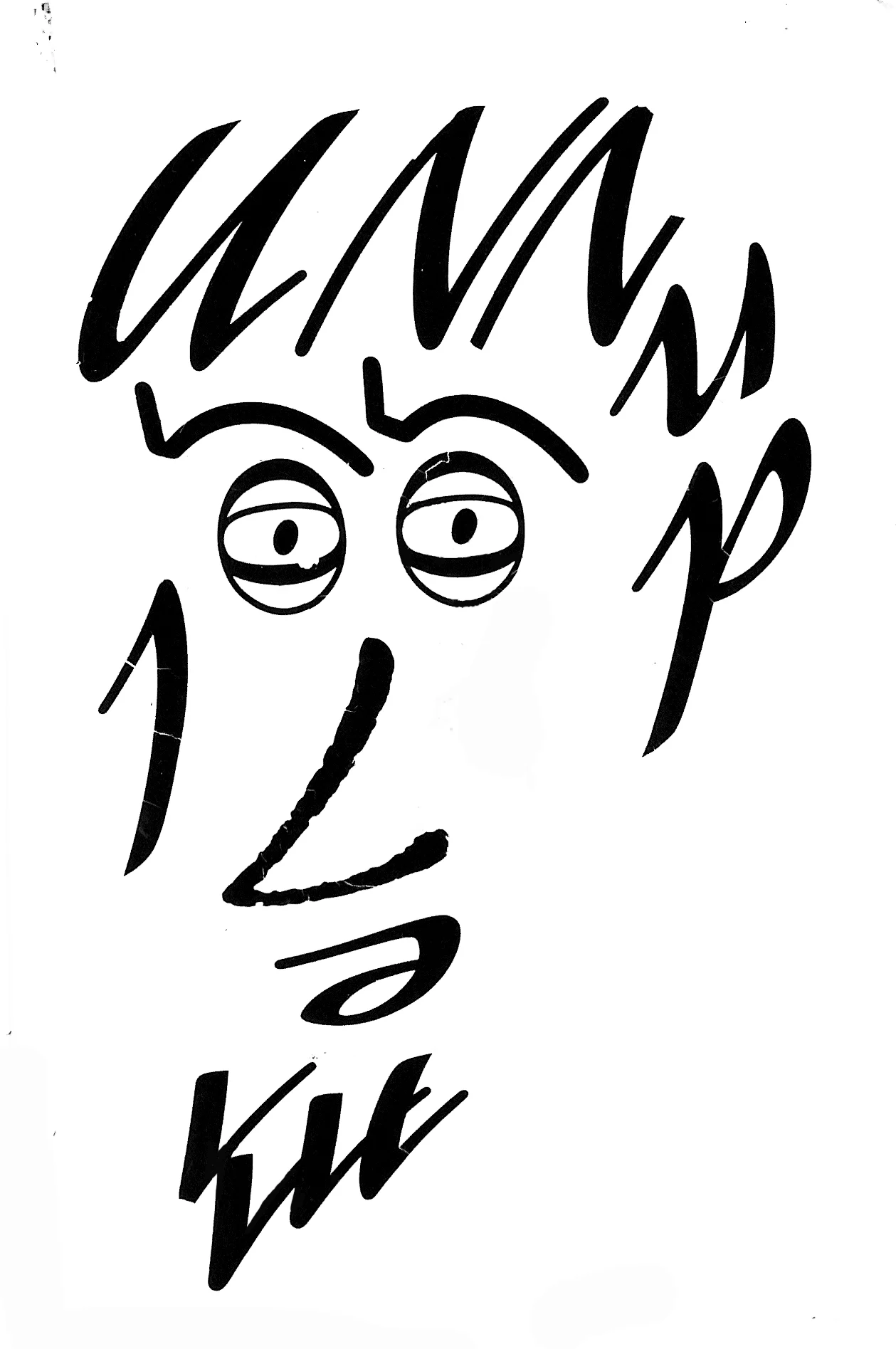
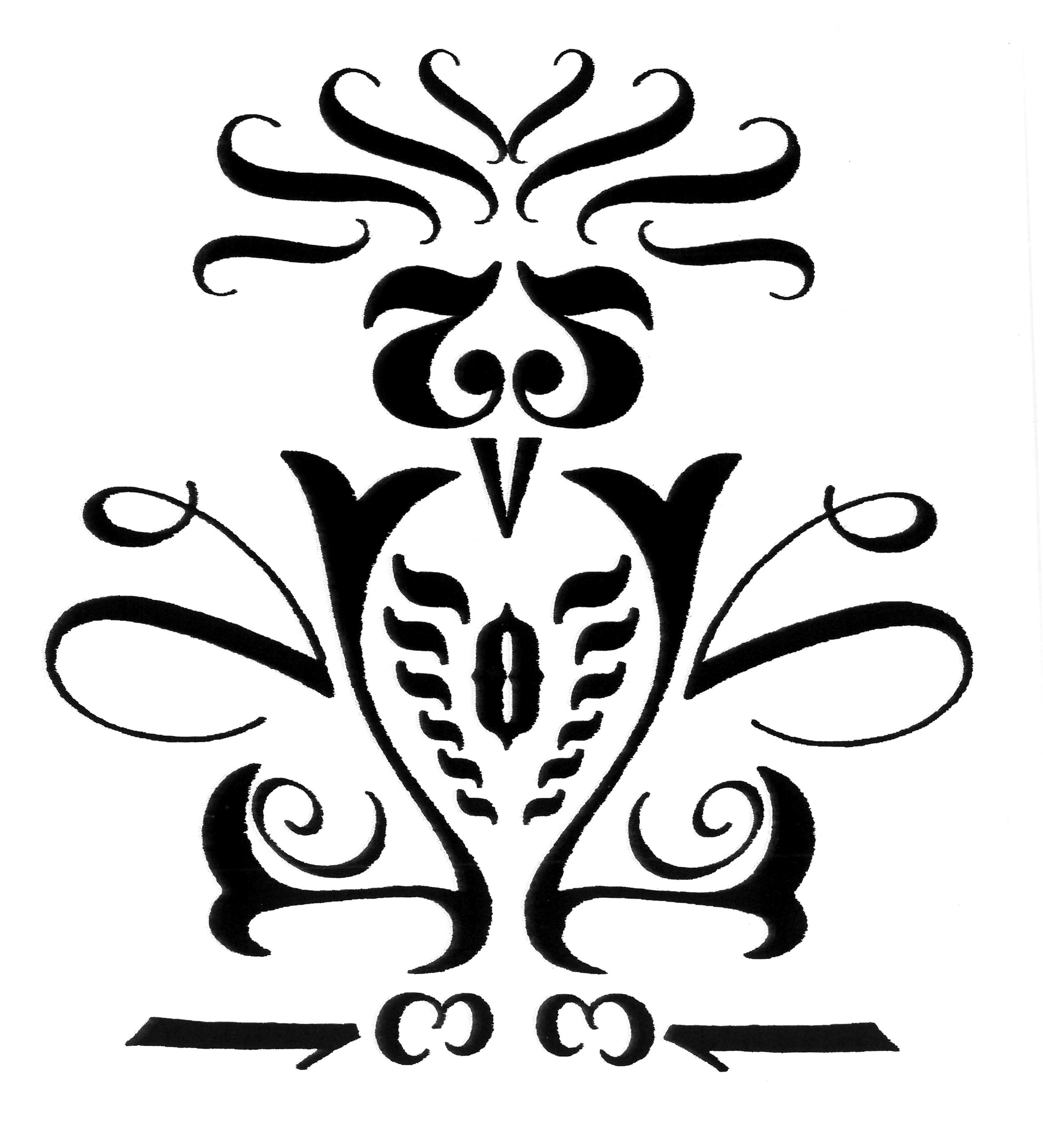
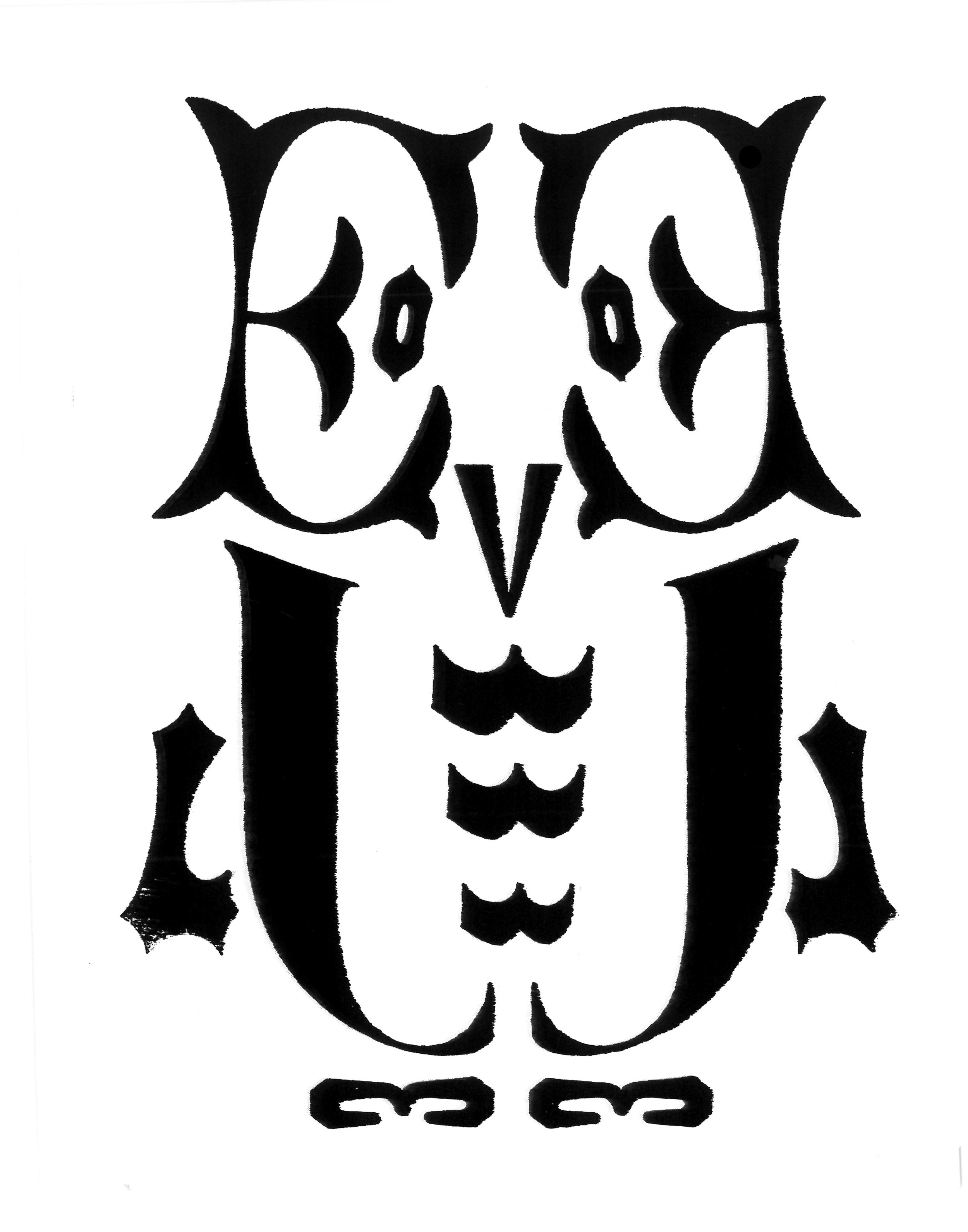
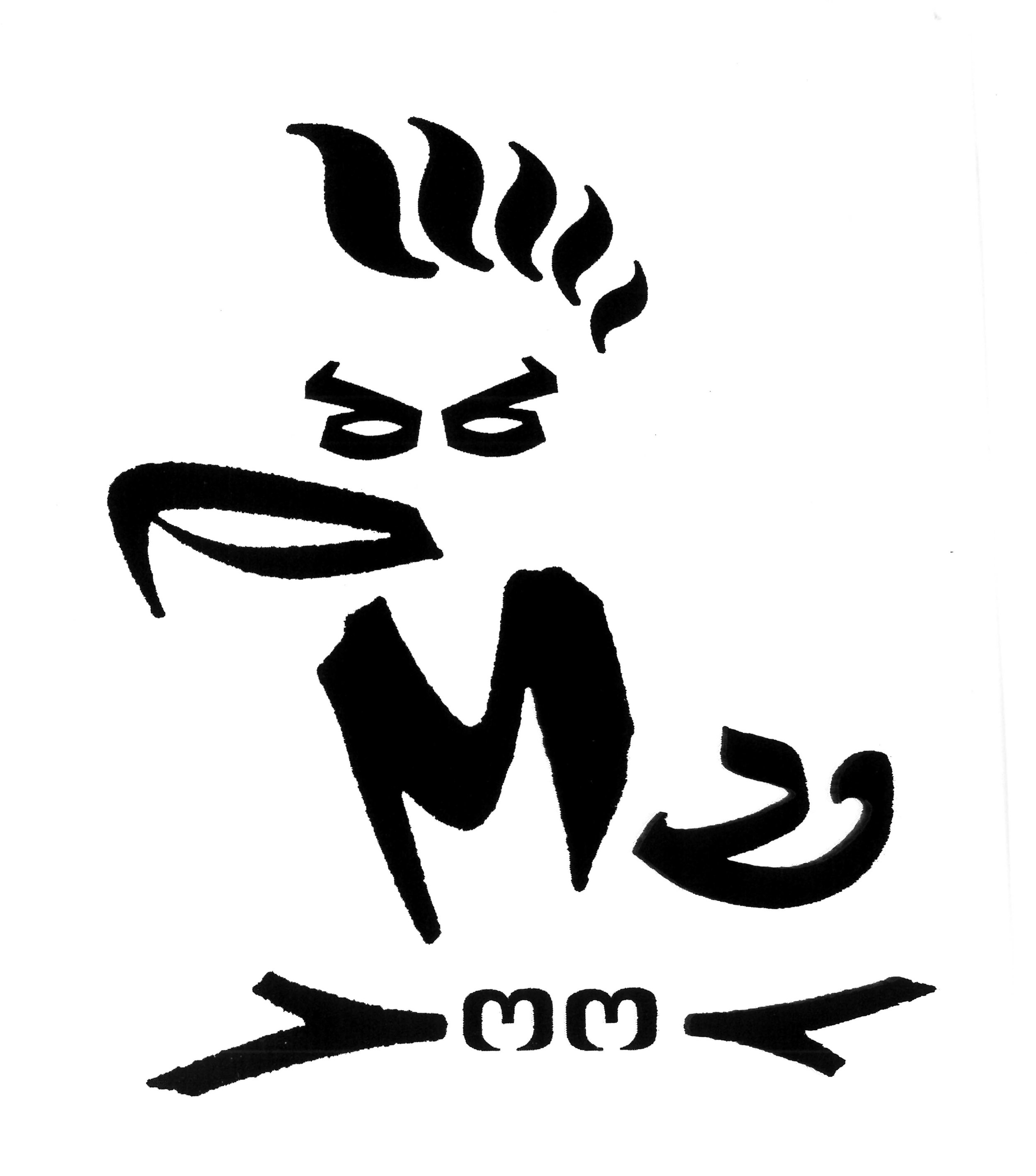
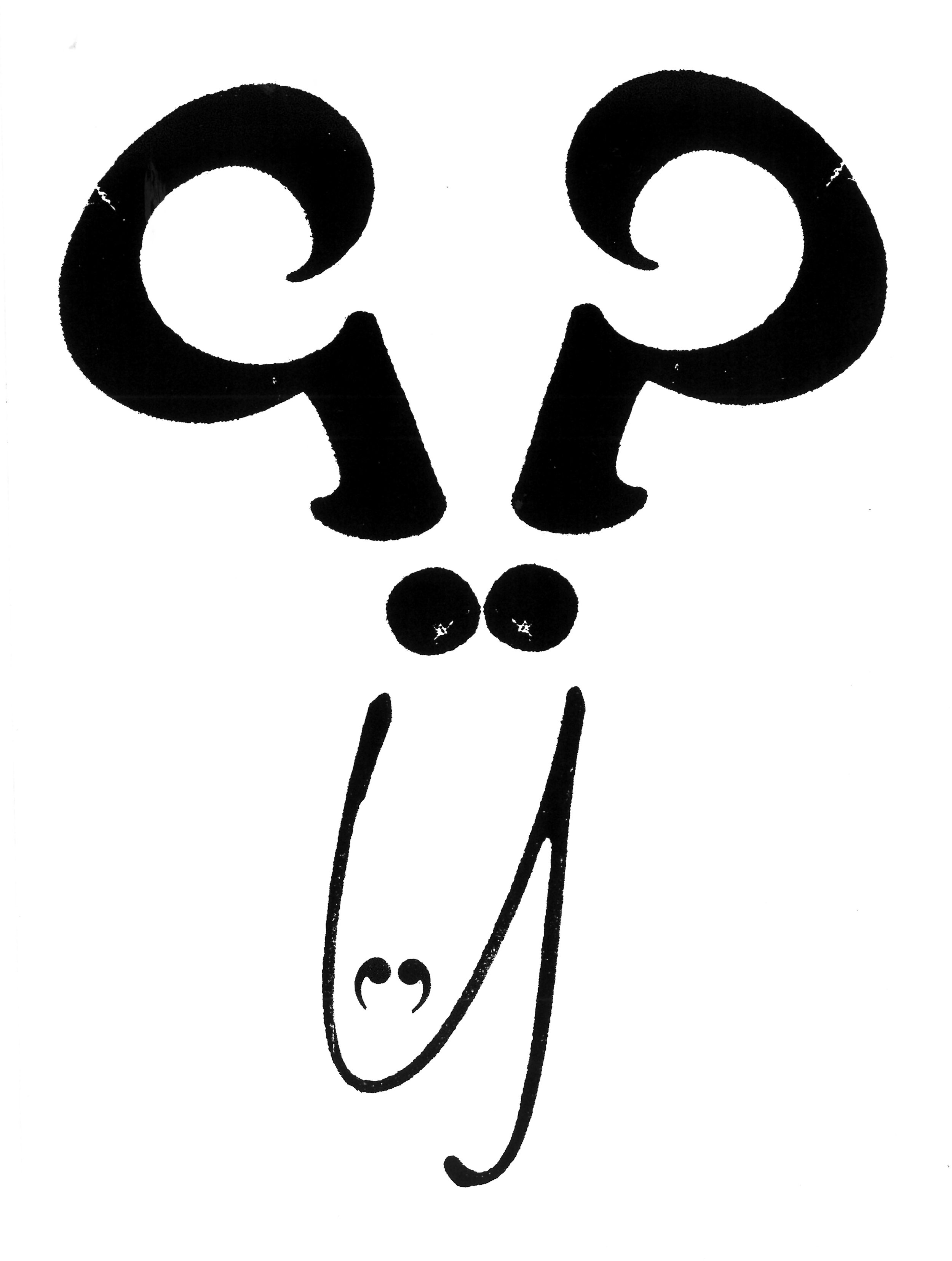
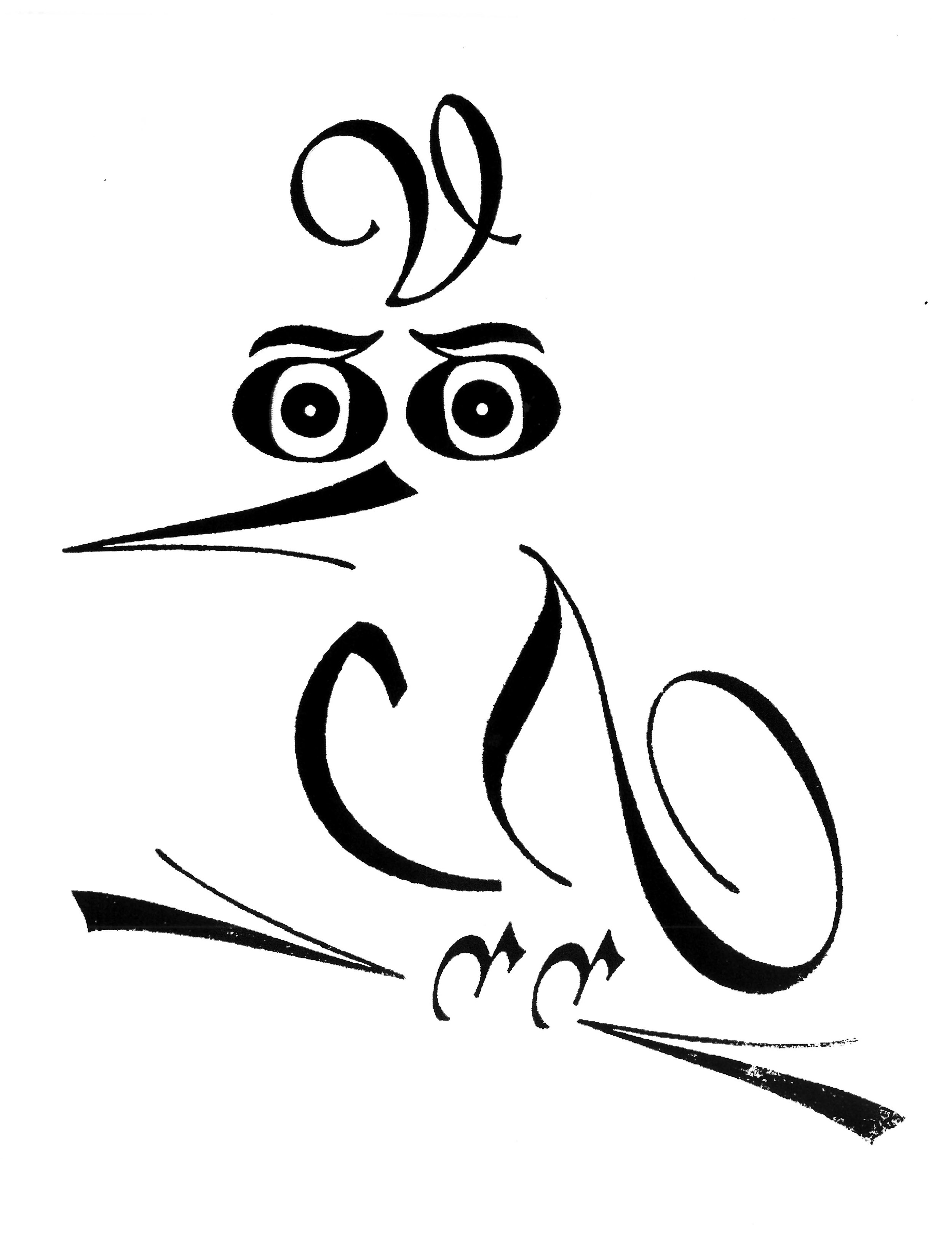
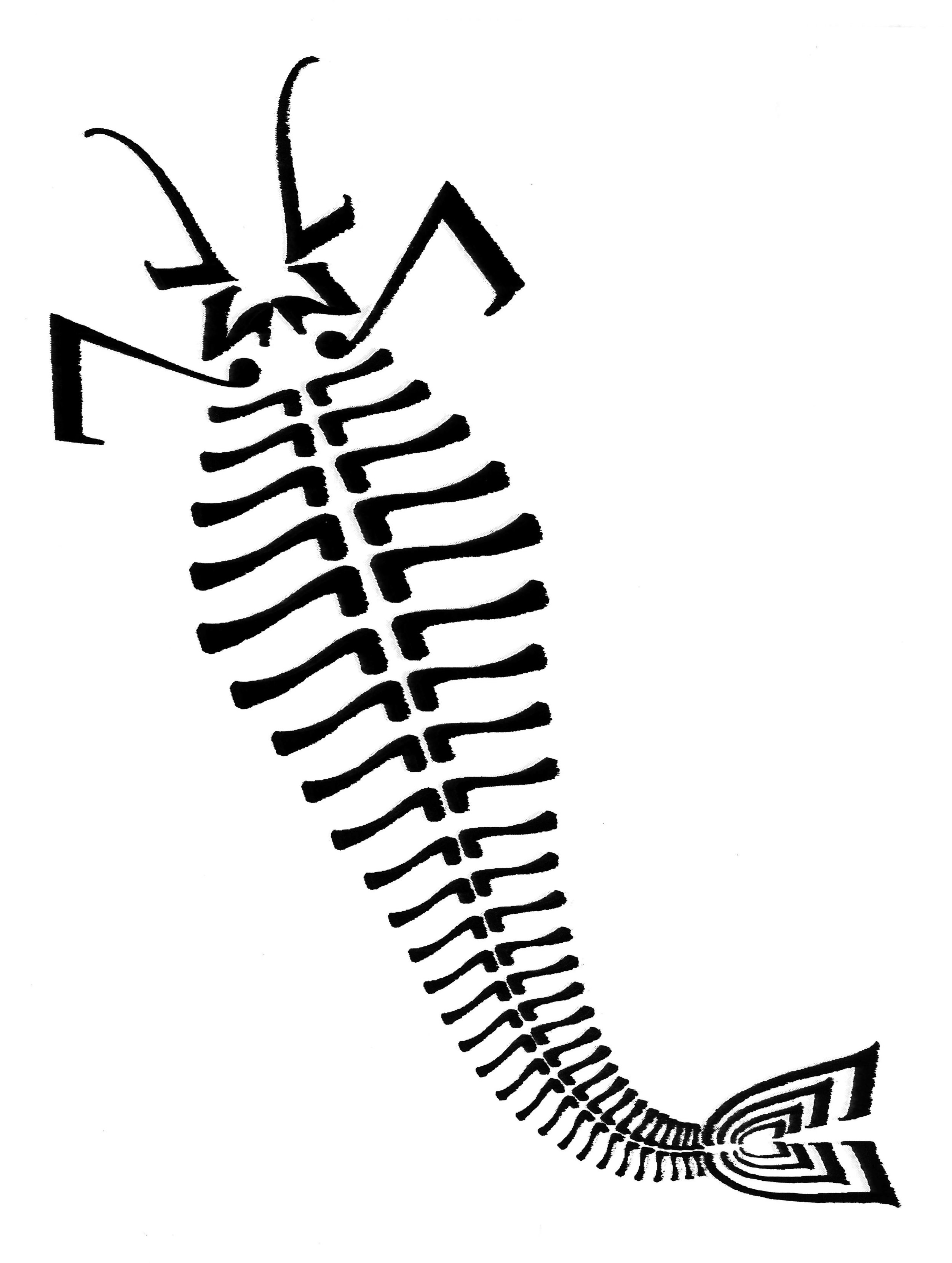
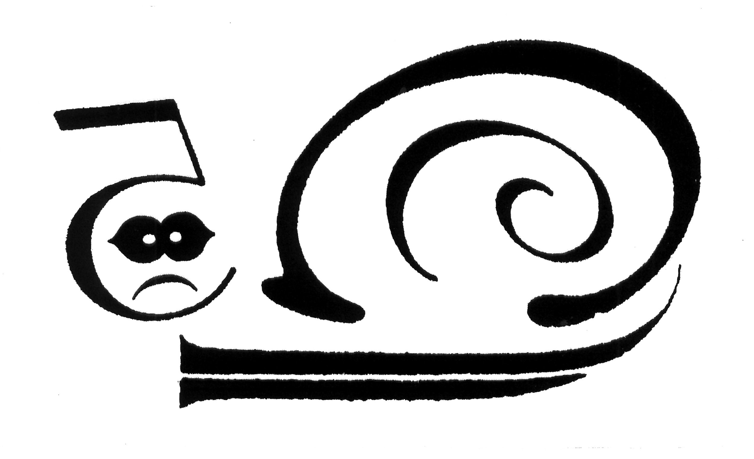
The Rev. Jackson Whitehead served as the ship's chaplain aboard the H.M.S Pica, sister ship to the H.M.S Beagle, which accompanied the Beagle on its second survey expedition in 1831. As well as being a highly visually perceptive man of the cloth, Whitehead was also a very keen amateur collector of fauna as well as a typography enthusiast.
Upon realising that the majority of both ships crews were either committed atheists or budding evolutionists, he embarked on entertaining himself between landfall by creating a whole series of creatures made up out of typographical characters. Some of these were based on the animals that they discovered and some were mere flights of fancy.
Only recently, after the restoration of Whitehead's ancestral Jacobean manor house, has the manuscript of his work set out before you come to light.

Rev. Jackson Whitehead – circa 1850


The Disciples Of Design are a global collective of design academics, practitioners, artists and students. We have one common thread – UCLan in Preston, UK; and one common aim – the creation of an ever evolving visual hub for the sharing of ideas and thoughts.