The Coop – Branding an Everyday Product
/Here we feature Angus Meikle’s response to the industry brief set by Edit Brand studios.


Please click on the image above to play the film.
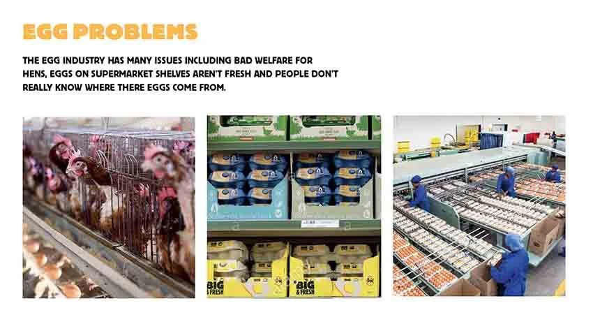
The Problem

The Mission Statement

The Word Mark

The Colour Pallet
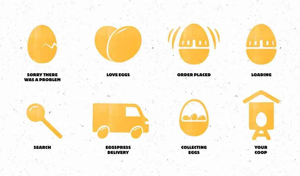
Egg Icon Designs

The System - How it works

How it works in context

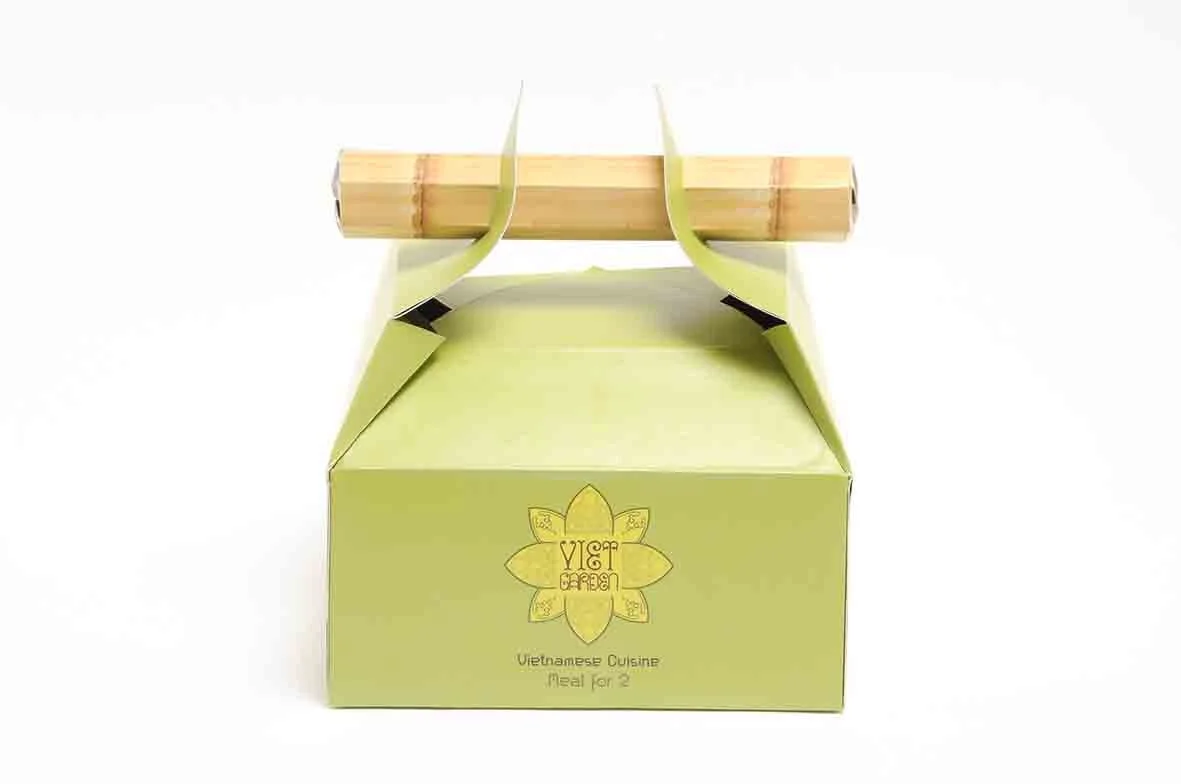
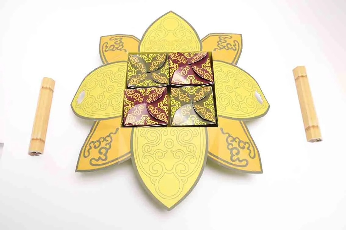
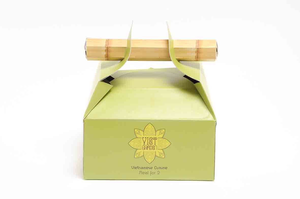
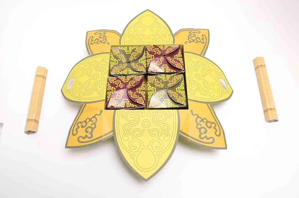
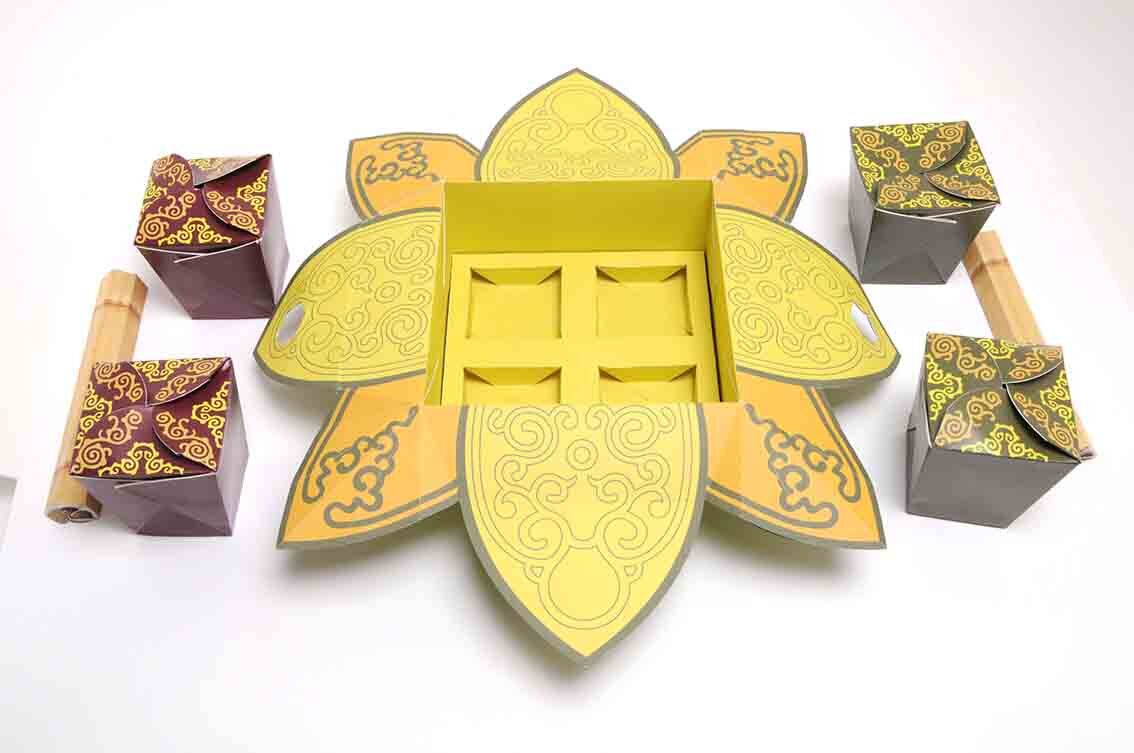
The Outer Packaging Design

Information printed on the inside of the packaging

A Sample of box designs with simple stamped logotype.

Click & Collect option

Cluck & Collect pick up coop’s

Van Livery & Uniform designs
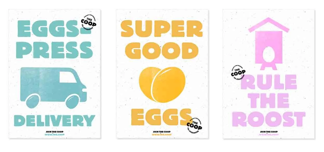
Poster Designs

Direct Mail Concept

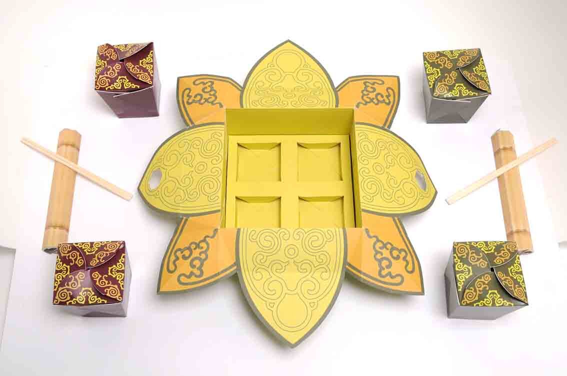
Merchandise Designs
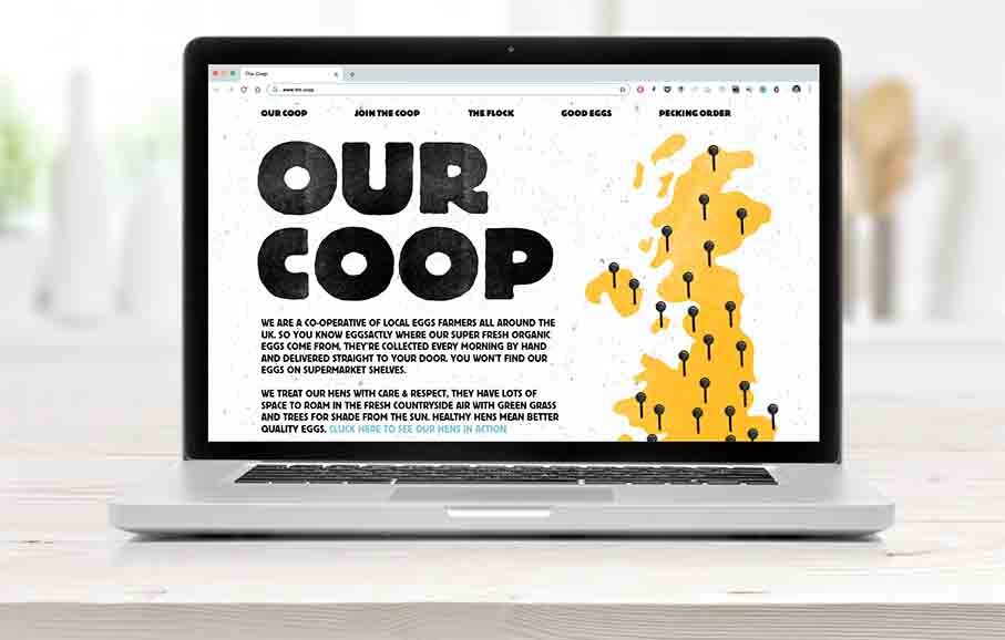
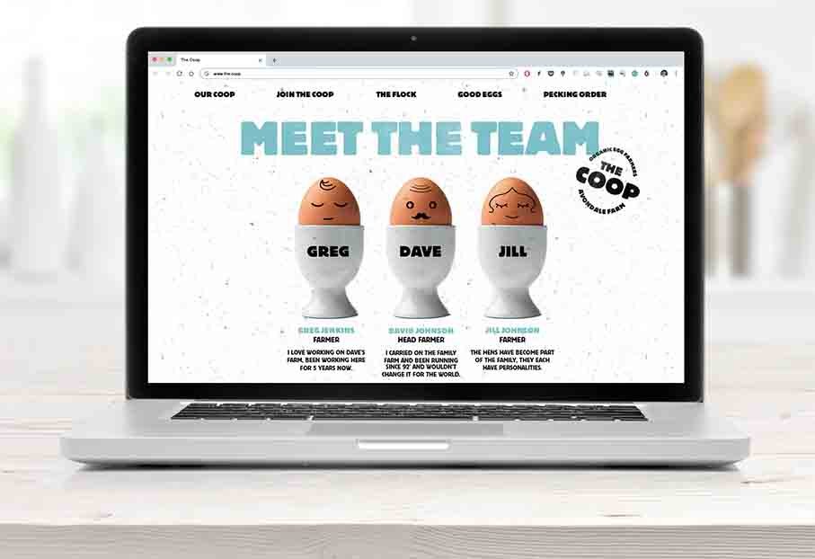

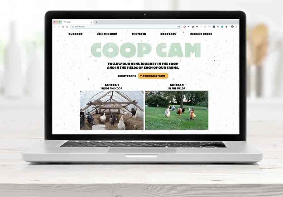
The short slide show above indicates some of the website content.

Instagram Feed

Copywriting
A great example of a thoroughly thought through branding exercise that combines all the basic elements.
An understanding of the problem, a creative overarching idea, demonstrated over an appropriate range of touch points. Considered typography, colour ways, iconography, materials as well as great copy writing all build to tell the story of ‘the coop’ brand and what they do.
This is also a great example for all year 1 students who are getting to grips with a branding exercise and has been specifically posted here in order for you to study, analyse, understand and learn from.